Similar to sections, rows also have a list of settings
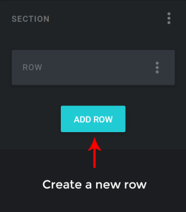
- To add a new row, click on ADD ROW button after expanding a Section in the Layout Manager
2. To edit a row, click on the row and the module editor will appear on the left.

If you are unable to select ( / highlight ) a Row, from the right panel, which may happen in cases where the columns occupy the entire row and when the row doesn’t have any margins, select a column within the row that you are trying to edit and use the breadcrumbs to navigate to the editor panel of its enclosing row.
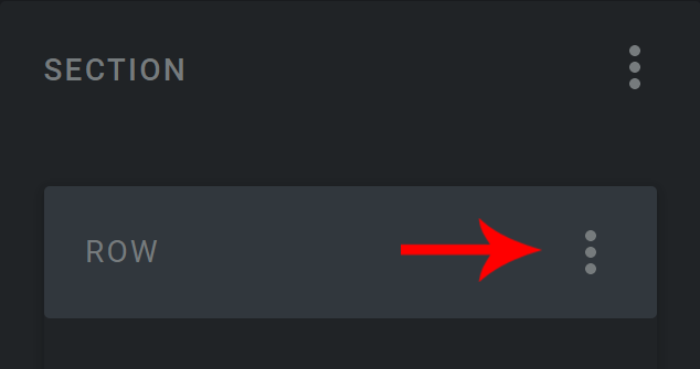
Another method to edit a row: click on the menu and select the option from the list
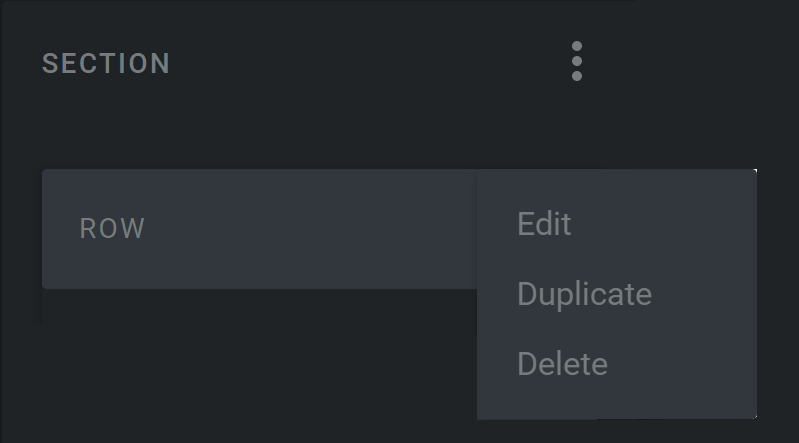
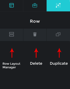
3. To duplicate a row, in the layout manager panel click the row after expanding the section and select the menu and from the options click duplicate
4. To delete a row, in the layout manager panel click the row after expanding the section and select the menu and from the options click delete
5. To rearrange a row, select and drag the row and place it in the required position
Settings #
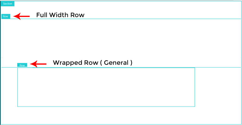
- FULL WIDTH ROW
Rows by default are wrapped to a max width of 1160px inside a Section and are centered to the screen.
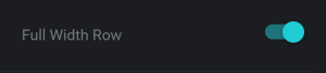
Use this option if you want the Row to expand and occupy the full width of the screen.
2. MARGIN BOTTOM OF ALL COLUMNS TO BE ZERO
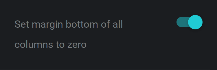
Setting the Margin bottom of all columns to be zero will overwrite the default values of the bottom margin to zero
3. ALL COLUMNS OF EQUAL HEIGHT
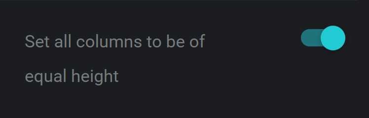
Setting the Margin bottom of all columns to be zero will overwrite the default values of the bottom margin to zero
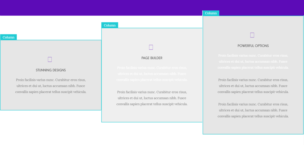
Columns of different height
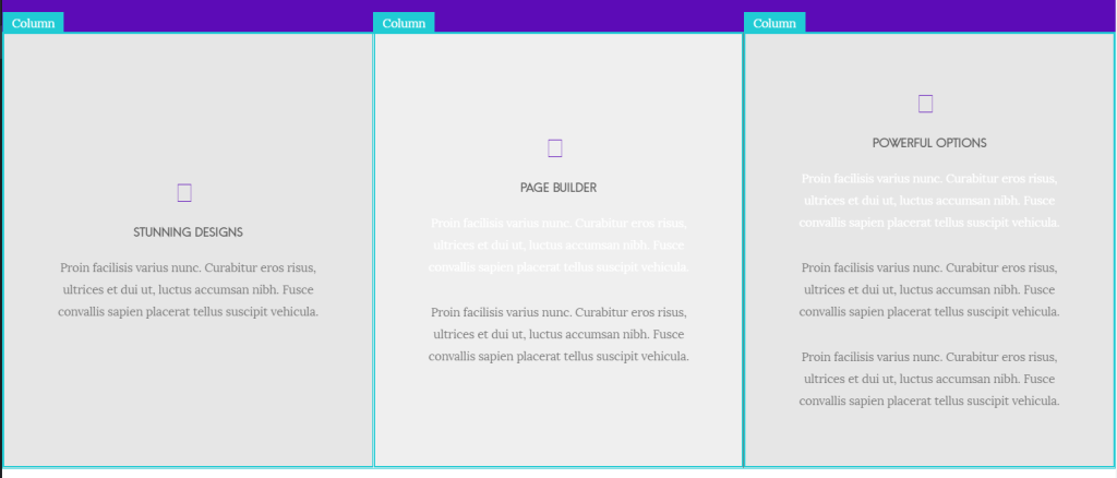
Columns of same height
4. SPACING BETWEEN COLUMNS
The spacing between all the columns in the row can be set from the list; in this case there are six options: Tiny, Small, Medium, Large, Zero, Custom
5. ROW ID
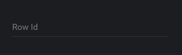
An unique id can be set for the row to customize it using css. (unique alpha numeric, no spaces, no special characters)
6. ROW CLASS
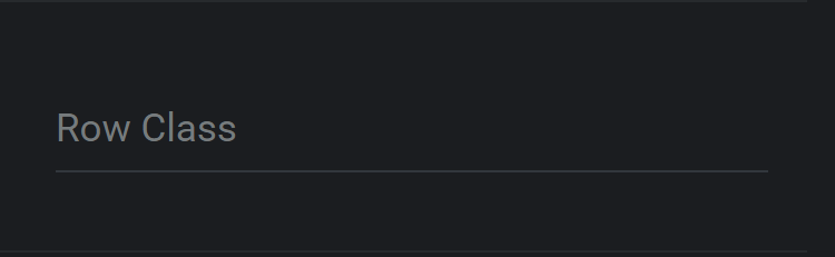
A class can be set for the row to customize it using css.
7. HIDE IN
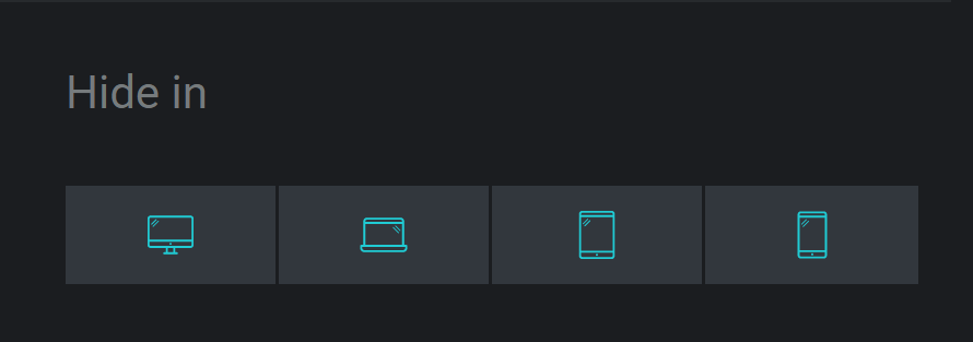
The row can be hidden from a specific screen size
Responsive Breakpoints
Mobile < 767px
Tablet – 768px – 1024px
Laptops – 1025px – 1377px
Desktops – > 1378px


