OSHINE provides various carousel / slider options for a single portfolio page. ( a page where you are taken to after clicking on a thumbnail in the grid )
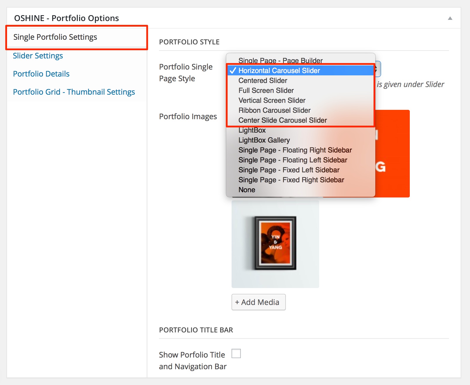
- Horizontal Carousel Slider
- Ribbon Carousel Slider
- Center Slide Carousel Slider
- Centered Slider
- Full Screen Slider
STEPS TO CREATE A SLIDER TYPE PORTFOLIO
1
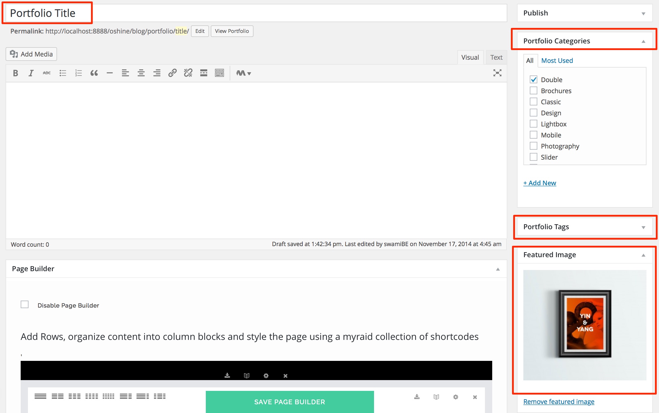
Navigate to PORTFOLIOS -> ADD NEW in your wordpress backend and create a new item by setting a Title & Featured Image. The Featured image is what will be used as a thumbnail in the Portfolio Grid. Optionally you can create & assign categories to your portfolio item.
2
In the same edit screen of the portfolio item that you created in the above step, locate the OSHINE – PORTFOLIO OPTIONS panel ( usually located beneath the Page Builder ). In the Single Portfolio Settings Tab, set the Portfolio Single Page Style option as one of the Sliders Listed above.
3
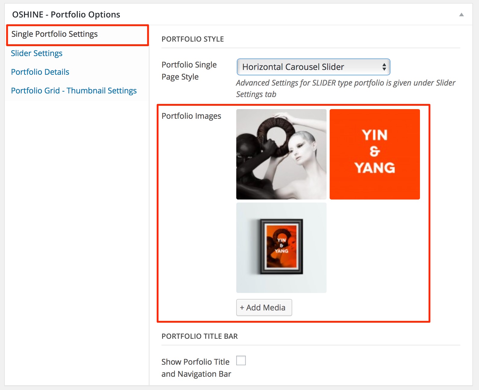
Upload the Images under the Portfolio Images option called in the Single Portfolio Settings Tab.
4
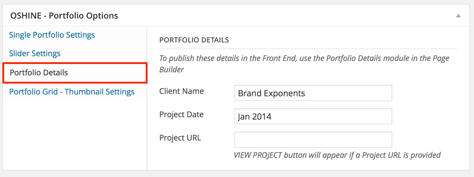
(Optional) The Project Details should be entered in the Portfolio Details Tab .
5
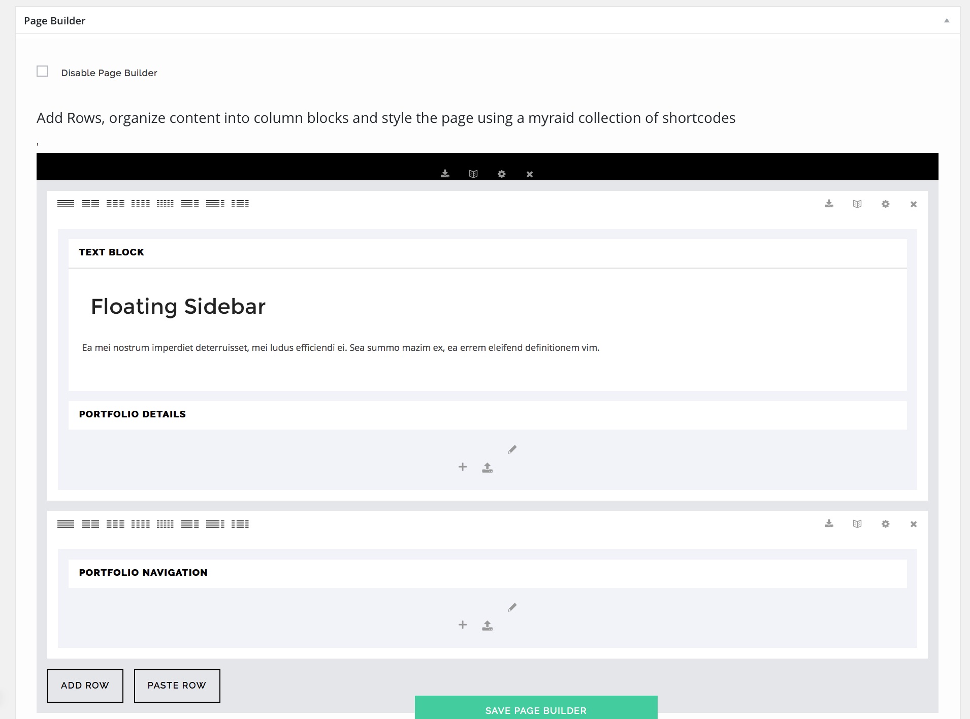
The content to be shown in the floating panel ( if SHOW INFORMATION BOX setting is checked in the Slider Settings Tab ) should be entered in the Page Builder ( if enabled ) or in the default content editor. You can use the PORTFOLIO DETAILS module in the Page Builder to publish information such as Clients , Project date etc. that were added in Step 4.
SLIDER SETTINGS
In addition to the Primary Steps above, the Slider Type Portfolios have a lot of additional settings that will enhance the Slider functionality. In the OSHINE – PORTFOLIO OPTIONS metabox, open the tab named Slider Settings to find the options.
Note: Some of the options are selectively applicable based on the Gallery Slider style chosen. The Options will toggle in the panel, based on your selection.
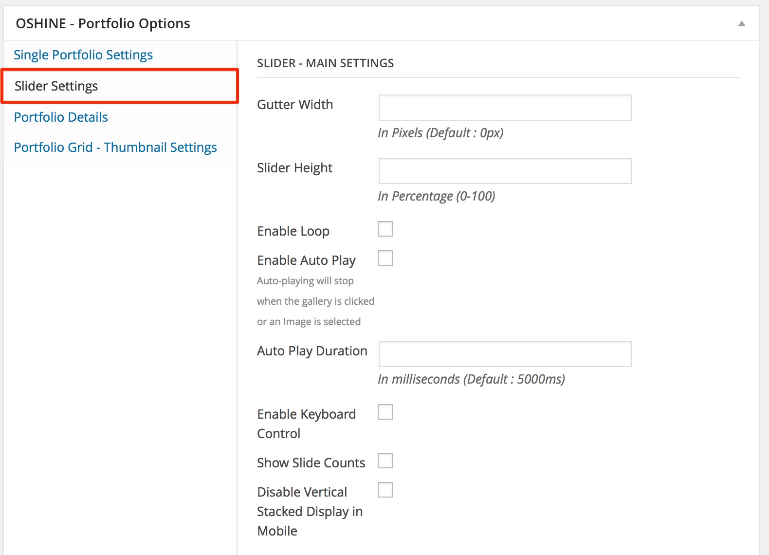
Main Settings : #
1. GUTTER WIDTH –
This is the spacing between adjacent images. Enter the value in pixels. Enter only the numbers.Note – This option is applicable on Carousel Sliders.
2. SLIDER HEIGHT –
This value will define the height of the Slider. Enter the value in percentage. Enter only numbers.Note – This option is applicable on Carousel Sliders and Centered Slider.
3. ENABLE LOOP –
If this option is enabled, the carousel / slider will loop infinitely by navigating the user to the first image after the last image in the slider is reached and vice versa.
4. ENABLE AUTO PLAY ( SLIDESHOW ) –
If this option is enabled, the carousel / slider will slide by itself. The slideshow will stop when the carousel is intervened by clicking a image or by manually navigating the slider.
5. AUTO PLAY DURATION –
This setting will determine the slideshow speed provided auto play is enabled using the above setting. Enter the duration in milli-seconds. Enter just the number, the units are not required. For ex: entering 5000, will make the slider move by itself every 5 seconds.
6. ENABLE KEYBOARD CONTROL –
If this option is enabled, the carousel / slider can be navigated using the next / previous arrows in the keyboard.
7. SHOW SLIDE COUNTS –
If this option is enabled, the current slider index and total number of images in the slider are shown.
8. DISABLE VERTICAL STACKED DISPLAY IN MOBILE –
In mobile devices all carousels / sliders will stack images one below the other instead of behaving like a gallery. Stacking offers the best user experience when there are a number of images in the slider or when a combination of videos & images are used, which is why it is enabled by default. If this option is checked, stacking will be disabled and you can have a touch friendly ( swipe-able ) gallery just.
Slider Thumbnail Settings: #

1. ENABLE SLIDER THUMBNAILS BAR –
If this option is enabled, a thumbnail carousel will appear beneath the main slider, which can be used for navigation
2. SHOW THUMBNAILS BAR –
Choose to show the thumbnails only in desktops or across all devices. It is best to have them shown in desktops alone and have disabled in mobile devices.
3. THUMBNAIL LAYOUT –
You have option to wrap the thumbnail bar or get it to occupy the full width of the screen. Note – The Background Color for the Thumbnail bar should be set up in the Options Panel under OSHINE OPTIONS > PORTFOLIO SETTINGS.
Other settings : #
1. SHOW INFORMATION BOX –
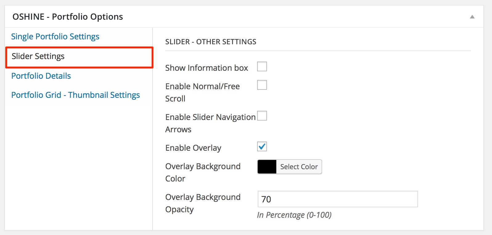
This option is to show/hide the Information Box. Displays a floating panel, in you can display content from either the page builder (if enabled ) or the default content. The Icon to open/close the Information Box will appear in the Bottom Right Corner of the Page.
2. ENABLE NORMAL/FREE SCROLL –
If this option is enabled, the carousel will no longer traverse one slide at a time, instead it will slide freely using mouse wheel in the case of a Horizontal Carousel, or by pinch and drag in the case of other sliders. The velocity of the mouse wheel scroll or the pinch & drag gesture will determine the number of images traversed.
3. ENABLE SLIDER NAVIGATION ARROWS –
Enable this option to show the Navigation Arrows on the Sliders
4. ENABLE OVERLAY –
Enabling this option will apply the overlay (as per the settings below) on the images in the Slider, except the one on focus/currently selected. Note – This option is applicable on Carousel Sliders.


