- ELEMENTS IN A TOP HEADER –
- Header Style :
- 1. Header Wrap –
- 2. TOP HEADER STYLE –
- 3. MENU SETTINGS –
- 4. HAMBURGER STYLE –
- 5. RIGHT SLIDEBAR/OVERLAY MENU BACKGROUND COLOR –
- 6. RIGHT SLIDEBAR/OVERLAY MENU BORDER COLOR –
- 7. SUBMENU BACKGROUND COLOR –
- 8. SUBMENU BORDER COLOR –
- 9. SET NAVIGATION LINK HOVER COLOR –
- 10. NAVIGATION LINK HOVER COLOR –
- 11. ENABLE STICKY HEADER – Click here to preview Sticky Header
- 12. SEMI TRANSPARENT BACKGROUND COLOR – Click here for Preview
- 13. HEADER BORDER COLOR – Click here for Preview
- 14. HEADER BORDER WRAP –
- 1. POSITION OF WIDGETS IN HEADER –
- Text and Code Widget Settings :
- Search Widget Settings :
- Cart Widget Settings – Click here to preview the Cart Widget
- Header Top Bar :
- Text and Code Widget Settings :
- Header Bottom Bar :
This Panel has the options related to the Top Header Layout Settings. Navigate to OSHINE OPTIONS > TOP HEADER LAYOUT on your dashboard to find the options below.
ELEMENTS IN A TOP HEADER – #
The elements of a Top Header are highlighted in the pictures below, which are – Header Style, Menu and Sub Menu, Header Widgets, Top bar and Bottom Bar. The individual options for each of these elements are explained below.


Header Style : #
Navigate toOSHINE OPTIONS > TOP HEADER SETTINGS > HEADER STYLE
1. Header Wrap – #
a. Wrapped Header
b. Full Width Header
This option is used to control the width of the Header. If you want the header to occupy the Full Screen Width, this option should be turned OFF. If you want the header to be wrapped, this options should be turned ON.
2. TOP HEADER STYLE – #
There are 12 different Top Header Styles available. View all the Top Header Styles.
3. MENU SETTINGS – #
- Menu Level – Determines the maximum menu level/depth level in numbers
- Special Menu Type – Determine the type of Special Menu for navigation. Works only if the Header Styles from above is chosen.
- Navigation Link Hover Style – Set the hover styles on the navigation links.
4. HAMBURGER STYLE – #
This option determines the style of the hamburger. There are 6 different hamburger styles available.
5. RIGHT SLIDEBAR/OVERLAY MENU BACKGROUND COLOR – #
a. Top Overlay Menu
b. Right Sliding Bar
The Background Color of the Right Sliding Menu / Top Overlay Menu can be set up here. The Right Sliding Menu can be enabled as one of the Widgets under the Header Widgets Panel Below.
6. RIGHT SLIDEBAR/OVERLAY MENU BORDER COLOR – #
The Border Color of the Right Sliding Menu / Top Overlay Menu can be set up here.
Submenu Settings :
7. SUBMENU BACKGROUND COLOR – #

The Background Color of the Top Bar Submenu can be set up here.
8. SUBMENU BORDER COLOR – #
The Border Color of the Top Bar Submenu can be set up here.
9. SET NAVIGATION LINK HOVER COLOR – #
You can enable this option to set up a hover color for menu links.
10. NAVIGATION LINK HOVER COLOR – #
You can select the menu link hover color here.
11. ENABLE STICKY HEADER – Click here to preview Sticky Header #
If Sticky Header is enabled, you will be able to see the Header Float along as you scroll the Page down. This is a Global option that will affect all pages. In addition to this, the option to Enable/Disable Sticky Header is available on every page in the Header and Hero Sections Metabox.
12. SEMI TRANSPARENT BACKGROUND COLOR – Click here for Preview #
This option to enable Semi Transparent Header is available in each page under the Header and Hero Sections Metabox. The Background Color for the Semi Transparent should be set up here.
13. HEADER BORDER COLOR – Click here for Preview #
Set up the Color and Style of the Border that will apply at the bottom of the Top Header
14. HEADER BORDER WRAP – #
This option is used to control the width of the Header Border. If you want the Border to occupy the Full Screen Width, this option should be turned OFF. If you want the Border to be wrapped, this option should be turned ON.
Header Widgets :
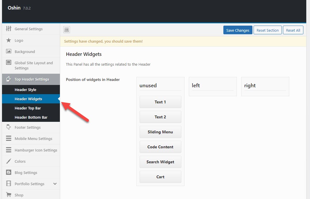
Navigate toOSHINE OPTIONS > TOP HEADER SETTINGS > HEADER WIDGETS
1. POSITION OF WIDGETS IN HEADER – #
You can see the various Header Widgets that is available. To place a Widget in the Header, you simply have to drag the respective widget block from the ‘UNUSED’ panel to ‘RIGHT or ‘LEFT’ accordingly.

Note 1 – The instructions on configuring Text 1 , Text 2 and Code Content widgets is given in the following option.
Note 2 – The Widgets will take the Color that is set for the Navigation Text under OSHINE OPTIONS > TYPOGRAPHY > MAIN NAVIGATION MENU.
Note 3 – The Widgets positioned in the LEFT will be automatically hidden when viewed in Mobile Screens. This is to ensure the contents fit in the Small Screen Size.
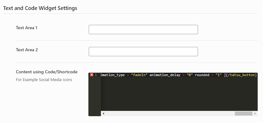
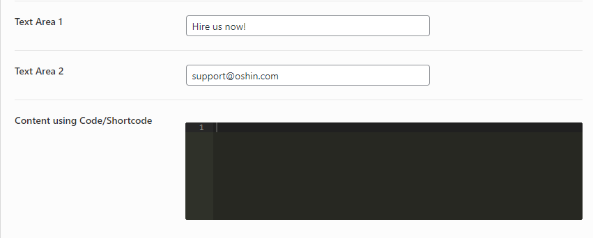
Text and Code Widget Settings : #

2. TEXT AREA 1 – #
You can add Text Content in here that can be showcased in the Header as Widget. Like Email or Phone Number.
3. TEXT AREA 2 – #
You can add Text Content in here that can be showcased in the Header as Widget. Like Email or Phone Number.
4. CODE CONTENT – #
You can add Code Content in here that can be showcased in the Header as Widget. You can add a Shortcode as well. Example – Icon or Button. To paste a Shortcode, you need to Create it in the Tatsu Page Builder in one of your pages, then click on the COPY icon in the Top Right Corner of the Module and Paste (CMD + V OR CTRL + V) it here.
Search Widget Settings : #
5. HEADER SEARCH WIDGET STYLE – #
There are 2 styles available in the theme Bar and Overlay Search.
6. SEARCH SCREEN BG – #
The Background Color of the Search Screen can be set up here. This is effective especially on the Overlay Type Search.
7. SEARCH TEXT COLOR – #
Text color on the Search Bar/Screen.
Cart Widget Settings – Click here to preview the Cart Widget #
8. HEADER CART NUMBER BACKGROUND COLOR – #
The background color that is set here will be applied to the Number of Items in the Cart displayed in the Header Cart Widget.
9. HEADER CART NUMBER TEXT COLOR #
The color that is set here will be applied to the Number of Items in the Cart displayed in the Header Cart Widget.
Header Top Bar : #
Navigate toOSHINE OPTIONS > TOP HEADER SETTINGS > HEADER TOP BAR
This is an optional setting. The Top Bar can be used in addition to the Main Header. This is applicable only on Top Header Styles. This bar can be used to placed additional content, secondary menu, widgets etc.
1. ENABLE TOP BAR – #
The Bar will be enabled only if the option is checked.
2. TOP BAR BACKGROUND COLOR – #
The Background Color of the Top Bar can be set up here.
3. TOPBAR TEXT COLOR – #
The Text Color of the contents in the Top Bar can be set up here.
4. TOP BAR BORDER (BOTTOM) COLOR – #
The Border Color, Style and Thickness for the Top Bar can be set up here. Border will be applied only at the Bottom.
5. POSITION OF WIDGETS IN THE TOP BAR – #
You can see the various Header Widgets that are available. To place a Widget in the Header, you simply have to drag the respective widget block from the ‘UNUSED’ panel to ‘RIGHT or ‘LEFT’ accordingly.
Note 1 – The Menu Links should be configured in the Dashboard under APPEARANCES > MENUS. Create a New Menu, add Links and assign it to the location called ‘Topbar Menu’ by checkboxes at the bottom and Save the Menu
Text and Code Widget Settings : #

6. TEXT AREA 1 – #
You can add Text Content in here that can be showcased in the Header as Widget. Like Email or Phone Number.
7. TEXT AREA 2 – #
You can add Text Content in here that can be showcased in the Header as Widget. Like Email or Phone Number.
8. CODE CONTENT #
You can add Code Content in here that can be showcased in the Top Bar. You can add a Shortcode as well. Example – Icon or Button. To paste a Shortcode, you need to Create it in the Tatsu Page Builder in one of your pages, then click on the COPY icon in the Top Right Corner of the Module and Paste (cmd + V or ctrl + V) it here.
Header Bottom Bar : #
Navigate toOSHINE OPTIONS > TOP HEADER SETTINGS > HEADER BOTTOM BAR
Note – The Bottom bar will appear along with the Main Header only if you have chosen the Header Style as Style 2 under the Header Style Panel.
1. BOTTOM BAR BACKGROUND COLOR – #
The Background Color for the Bottom Bar can be set up here .
2. BOTTOM BAR BORDER COLOR – #
The Border Color, Style and Thickness for the Bottom Bar can be set up here. Border will be applied at the Top and Bottom.
[/tatsu_text][/tatsu_column][/tatsu_row][/tatsu_section]


